
Premium ClubPB-0058
Xtraburger
xtraburger.com
One letter short of extra, one step past ordinary
$5,000
Scorecard
How names are chosen- Memorability
- 5/5The opening X is a hook; people recall the letter before the word
- Pronounceability
- 4/5Read as 'extra' almost at once, though the missing e may slow a few readers
- Brevity
- 3/5Ten letters, and the X alone can stand in for the whole name
- Distinctiveness
- 4/5The X sets it apart, though 'extra' is a common word on menus
The story
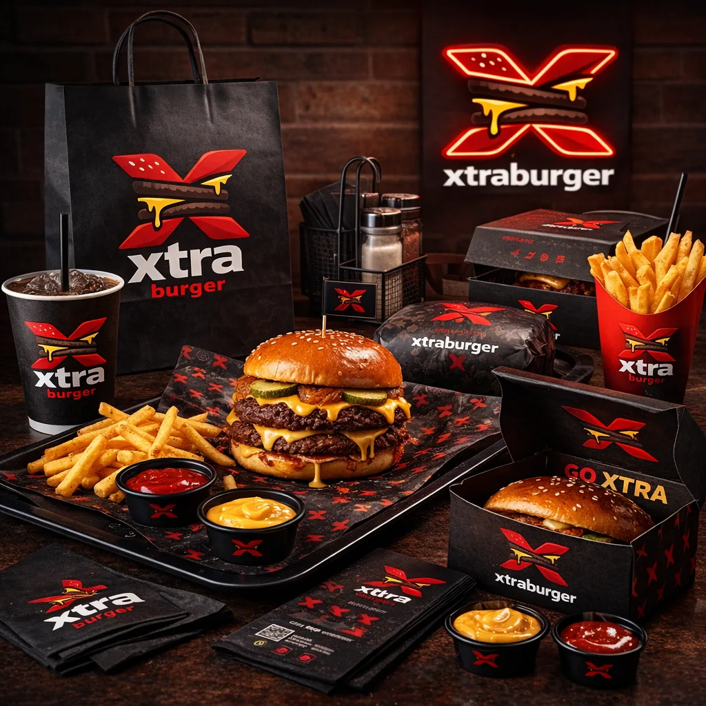
Some letters work harder than others. X marks a spot, signs a name, counts a vote and stands in for whatever cannot quite be described. Xtraburger hands that letter to a burger and puts it to work on all four.
The idea is the X-factor: a burger that cannot be had anywhere else, with something in it that would make people cross town and then struggle to explain why. The name never says what the extra is. That is its strength. It poses a question, and each visit would be the answer.
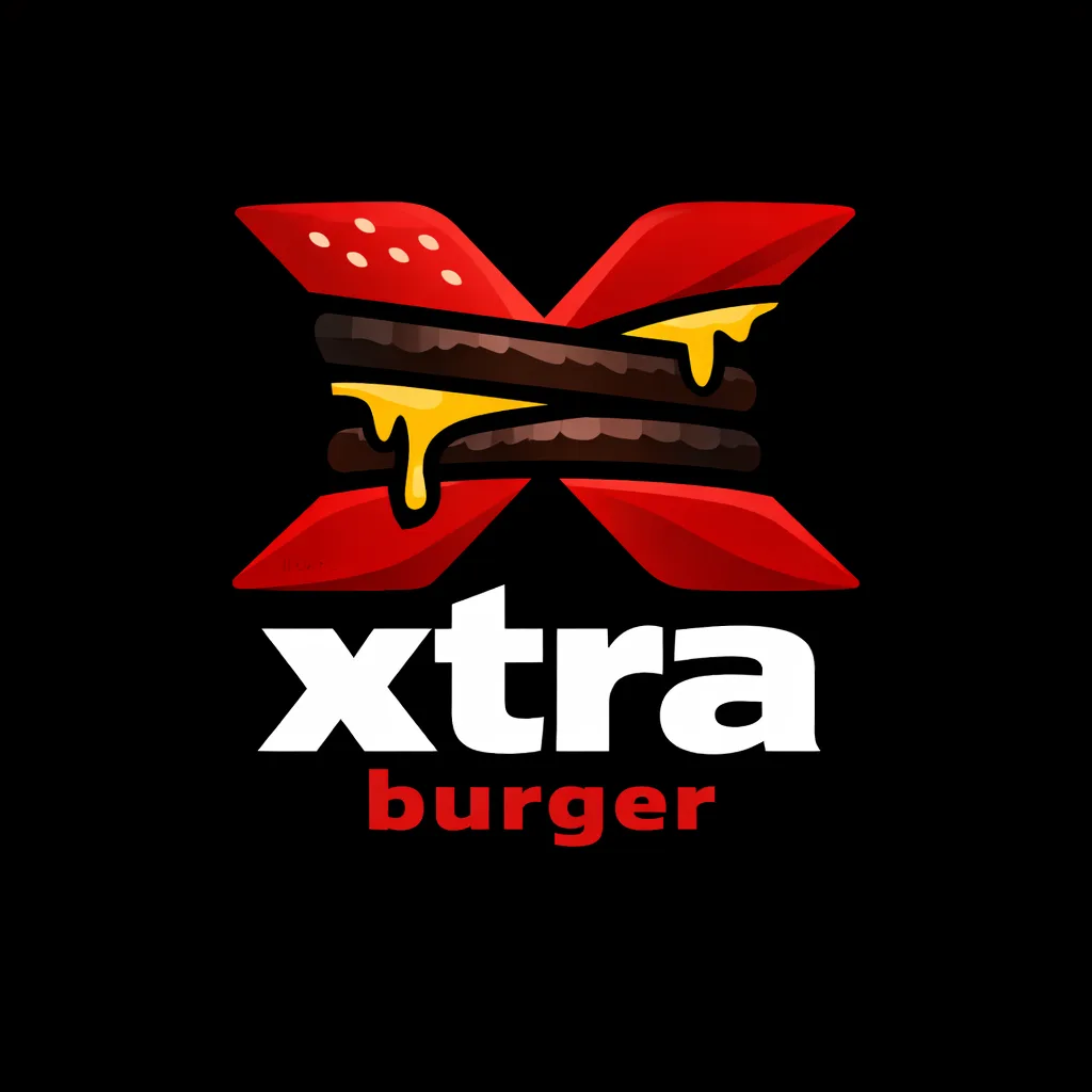
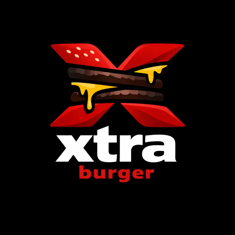
The logo is a neat piece of wit. The X is built from the burger itself: two halves of a red sesame bun crossed like blades, with a pair of patties and dripping cheese slung across the middle. Beneath it, a white lowercase "xtra" sits over a red "burger", which keeps the loud letter in charge and the noun in support. Black, red and a flash of yellow make a palette closer to a streetwear label than a roadside diner.
The mock-up shop carries the mark onto everything: a black carrier bag, paper cups, wrappers, a red fries carton, sauce pots stamped with a single X, and a neon version glowing on a brick wall. Open a box and the inside of the lid offers the brand's whole philosophy in two words: "GO XTRA".
Why it works
An X at the front of a word is a signal people read at once: the unknown, the added, the factor nobody can quite name. Xtraburger uses it to set a burger apart before anyone has tasted it, and the letter alone makes a mark that works on a box lid, a sauce pot or an app icon. It leaves the menu free to decide what the extra is.
Who this suits
- A chef-led burger bar built around one signature item nobody else serves
- A fast-casual brand with streetwear ambitions that needs a mark strong enough for merchandise
- A burger franchise planning an ordering app where the X becomes the icon
Suggested uses
- a signature burger restaurant
- a fast-casual chain
- a streetwear and merchandise line
- a guest-chef collaboration menu
Mock-ups
Drawn from the logo by this site, to show the name at work on a card, a phone, a homepage and a shopfront.
Xtraburger
xtraburger.comxtraburger.com
Menu · Visit · OrderOne letter short of extra, one step past ordinary
Find usWhat you receive
- The registration of
xtraburger.com, transferred to your account - The wordmark as an SVG file, with a colour suggestion
- The story and rationale on this page, for your own use
Not included
- A registered trademark
- A company registration
A trademark can only be applied for by an operating business, for its own goods and territories. The terms explain what is and is not sold.